


Charlotte and I have just returned from Madrid, a city we fall increasingly in love with. We had the great pleasure to be invited to Michael S Smith’s birthday weekend where we enjoyed a sumptuous cascade of entertainment
Fabric and upholstery in the Georgian Period and Michael S Smith Fabrics.
27 May 2016
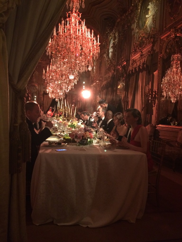
Divine celebrations in Madrid with Michael S Smith.
We also managed to squeeze in some shopping and culture at the Prado.
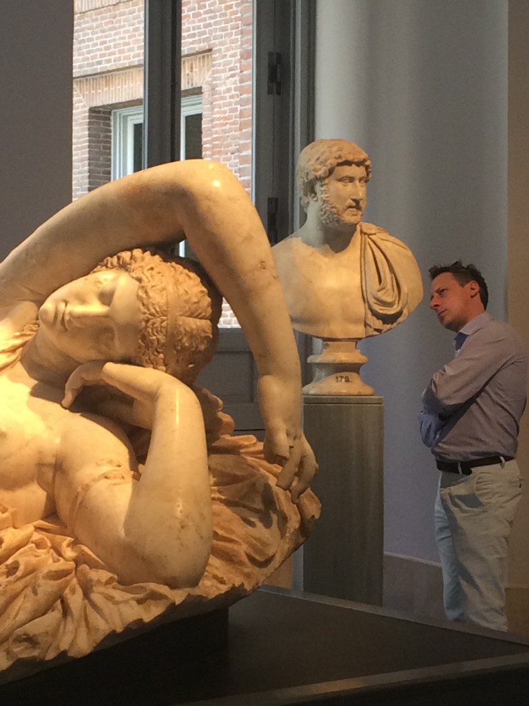
Roman sculpture at the Prado.
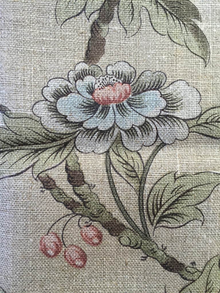
We have been sellingMichael Smith’s fabrics and wallpapers through Jamb, exclusively in the UK and Europe, for the past six years. United by our mutual love for the English country house aesthetic, the collaboration has gone from strength to strength. Michael has designed many of the fabrics from his personal archive of historic designs and his fabrics reflect the Georgian principles of craftsmanship of the highest quality.
Michael S Smith’s Mercury fabric as seen in World of Interiors this month.
Fabric and upholstery was hugely significant in the decoration of the English country house especially at the very beginning of the eighteenth century, when the role of upholsterer was deemed even more important than the cabinet maker. Textiles were even referred to as the furniture. It was instrumental in creating a sense of cohesion as well as texture, pattern, richness and colour. The most respected designers and decorators would start by considering the tones of the central point of the room, the fireplace followed by the tapestries. From this juncture the unified colours and fabrics of the curtains, bed hangings and furniture would be determined.
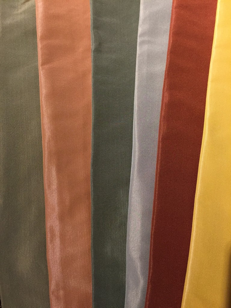
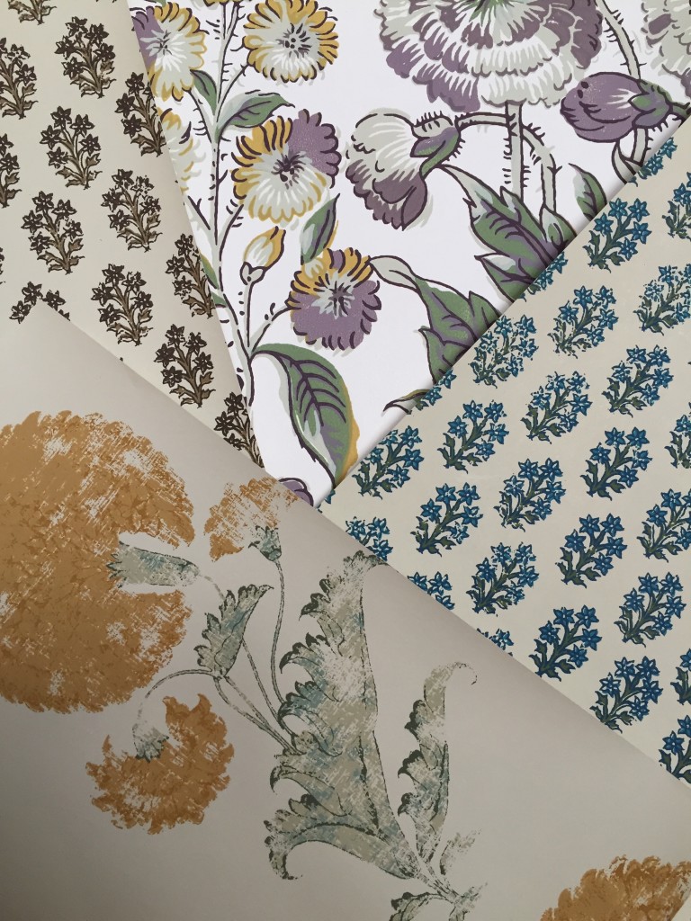
Michael S Smith’s Crescent silks available in nine different colour ways.
Fabrics were luxurious and brocades, damasks, velvets silks and imported chintz came at a price. Fabric was only used on the walls of very grand rooms and the most significant colours were red, green, blue and yellow.
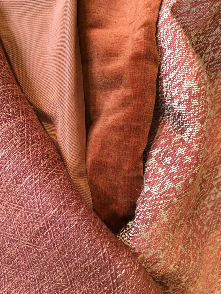
The richness of Michael S Smith’s fabrics.
Colour was symbolic. Red symbolised the absolute best and was used in rooms of ‘parade’. Green was associated with Venus, the goddess of love and sleep and therefore used in bedrooms. Some houses also used green in other important rooms such as the drawing room – stepping towards a more relaxed, informal style. Blue symbolised piety and sincerity and yellow could be seen to represent happiness and hope.
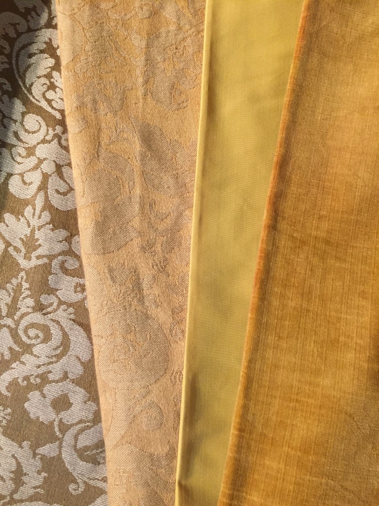
Damasks, silks and velvets in Michael S Smith’s fabric collections.
The production of floral chintzes, printed from wood blocks in dark browns, greens and yellows also increased during the eighteenth century and with the availability of greatly improved dyes, more realistic colours were produced.
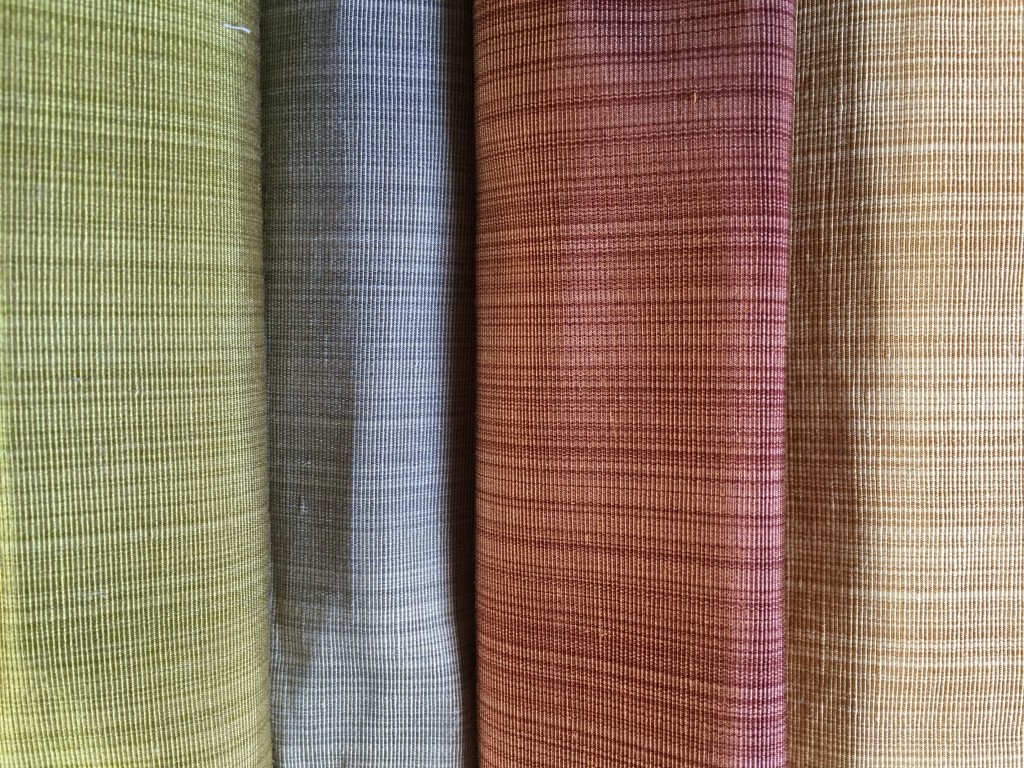
The Devonshire that comes in blue/green, brown, coral/turquoise and green.
As the period progressed, there was an increased sense of informality and lighter coloured fabrics and pale and subtle florals were introduced.
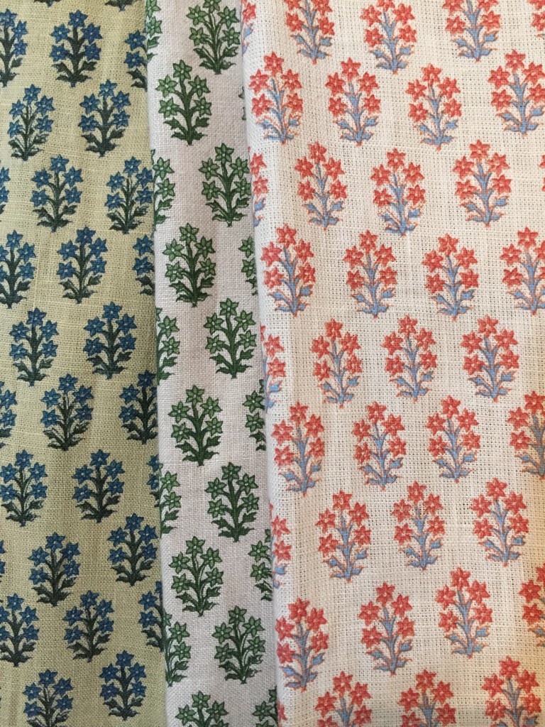
The Blenheim sprig Jasper fabric.
Other prints included toile de joue, a printed fabric depicting rural scenes that was introduced from France in the mid eighteenth century and the influence of Chinoiserie was reflected in fabric designs with chinese motifs like peonies and chrysanthemums.
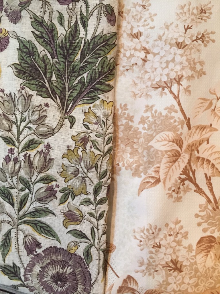
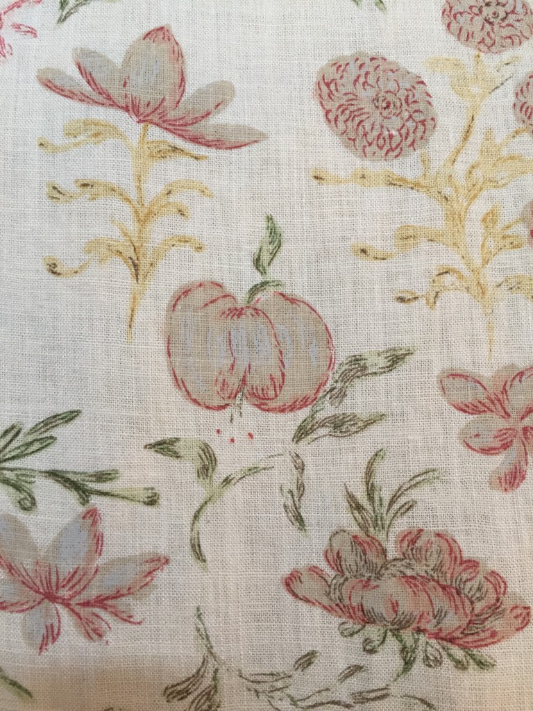
Isle flower that comes in fawn, aubergine and blue coral and the Deauville fabric that comes in blue, sage and tan.
Hand made paper and print techniques grew in the Georgian period. Textured wall coverings called flocking was introduced and was increasingly used in the most important rooms of the house.
Michael S Smith’s Indian flower, Devonshire and Isle flower wallpapers.
When Rudolph Ackermann published his monthly magazine, ‘The Repository of Arts, Literature, Commerce, Manufacturer, Fashions and Politics’ in the nineteenth century, it illustrated the predominant tastes and opinions of the time. Up to this point upholstery through the centuries had been rigid. Upholstery and fabrics were designed to match entirely through colour. Yet in the reign of Prince Regent interiors became more relaxed. Ackermann promoted simpler, lighter treatments for all kinds of rooms. More possibilities were offered and a wider range of patterns available.
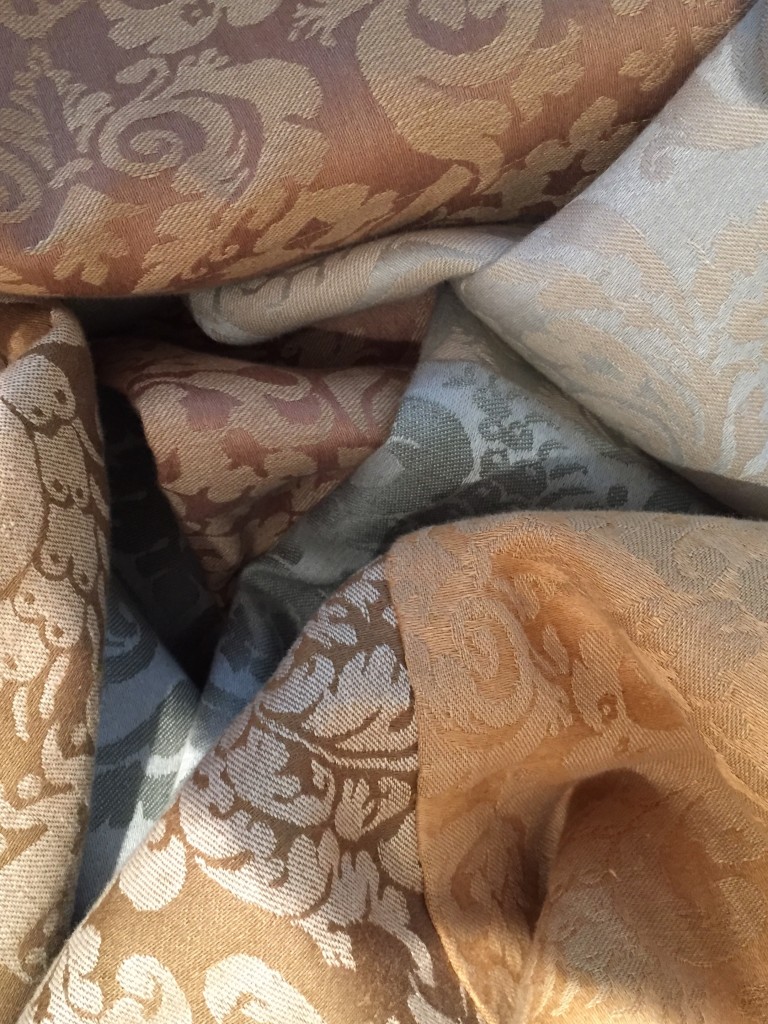
Cornaro Damask fabrics that comes in seven different colour ways in the Jasper fabric range.
The patterns changed so frequently that many designs can be attributed to particular years, in a similar way to how fashion can be traced now. It was still fashionable for the walls to match the upholstery but the fashion to match the furniture coverings to the walls of the room subsided and harmonious combinations were suggested. There were still obligatory colours for rooms. For the dining room “ scarlet or crimson will ever hold the preference”. Tea coloured or ruby damasks were often used for libraries and cotton velvet produced a rich effect for a library or study.
Michael S Smith’s Silks in the Templeton fabric range.
The gifted cabinet maker and sculptor George Bullock suggested more delicate fabrics and colours in 1813.
Wallace Vine that comes in five different colour ways.
There are over three hundred fabrics in the collections, in an array of different colours and it is liberating to live in a time where the possibilities for interior design and upholstery are endless. Michael’s depth of knowledge and understanding of the evolution of fabric make this one of the most rounded and elegant collections of our day.
